This project aims to provide a pragmatic theme fully integrated into Bootstrap 4 and the best possible experience out of the box: right after Drupal installation: All native Drupal blocks and menus are placed and stylized along with all native pages and forms. It also intended to be a Bootstrap 4 base solution for developers with SCSS files provided.
This theme feature an advanced main navigation for desktop and mobile with a dynamic search bar, see it in action in the animated gif on the right side of the page.
Comparison with the main themes based on Bootstrap
Bootstrap is based on Bootstrap 3, this theme on bootstrap 4. It does not offer a "ready to use" solution as this theme does.
Barrio offers a advanced configuration in the theme settings of the Bootstrap 4 components/layout and color/font. This may be out of reach for normal users and also a constraint for developers who want to have total control over front-end development with only the Twig templates and SCSS files as this theme offers. It does not offer a "ready to use" solution as this theme does.
FEATURES
- Sticky navbar with dynamic search bar- Admin Toolbar compatible
- Responsive branding header with Logo, slogan and site name
- Responsive footer and sub footer each with three regions
- A side column sticky
- Language menu with flag (fr, en, es, de, nl, it, pt-pt, pt-br, ru)
- Comments [Demo], Books [Demo] and forums [Demo] are stylized and are responsive
- All forms are stylized
- Print version
The theme is entirely built with the Bootstrap grid system and maximum usage of bootstrap classes.
List of Bootstrap components integrated : status message, pager, breadcrumbs, tooltips, popover, modal, carousel, form (custom style) : submit, input, checkbox, select, radio, textfield.
List of contact types (mail, phone, etc..)
The first footer region is configured to contain a list of contact types (mail, phone, etc..); it will automatically add the icons to a list (ul). You have the possibility to copy the code provided in the resources/HTML folder.
Social icon
Social icon resources/HTML code (svg) is provided in the resources/HTML folder.
Bootstrap Modal
Modal code is available in resources/HTML folder. Copy the modal box code in a custom block that you create with full html text format, and place the created block in the modal region. Specify the page where it is displayed in the block settings, DO NOT display the title of the block. Finally, copy thebutton modal code in the corresponding page.
BETTER ADMINISTRATION
The Adminimal suite of modules is the ultimate administration theming solution for Drupal. In ressources/css there is a adminimal-custom.css that match the color scheme of this theme. To use it, copy to the files folder and tick "Use adminimal-custom.css" in /admin/appearance/settings/adminimal_theme. This is a native feature of the Adminimal theme.
List of modules to install: Admin Toolbar, Adminimal Admin Toolbar, Adminimal theme.
SUGGESTED MODULES
View content hits - core module
To display the view counter on the public website.
Pathauto
pathauto will automatically generate URL/path aliases for various kinds of content. Below is a suggestion for the patterns to use for the different types of entities:
Content: article: [node:content-type:name]/[node:title]
Content: page: [node:title]
Content: book: book/[node:book:parents:join-path]/[node:title]
Content: forum: forum/[node:taxonomy_forums:entity:parents:join-path]/[node:taxonomy_forums:entity:name]/[node:title]
taxonomy: [term:vocabulary]/[term:parents:join-path]/[term:name]
media: media/[media:bundle]/[media:name]
user: user/[user:account-name]
Form placeholder
form_placeholder transforms forms labels into placeholders. It makes the form clearer and more user friendly.
This is the list of IDs to add in the text area Include text fields matching the pattern of the config page /admin/config/user-interface/form-placeholder:
#edit-mail
#edit-message-0-value
#edit-name
#edit-subject-0-value
#edit-pass
#edit-comment-body-0-value
Honeypot
honeypot protect your form from spam without punishing the user with a captcha.
Allowed Formats
Allowed Formats allow for the removal of the text formats guidelines below forms.
CUSTOMIZING
In this theme there are tools for you to customize it with and whitout a subtheme. Note that this theme is designed to be stylized with SCSS, but there is a custom CSS available. Gulp file is provided to compile SCCS files and configured to be built with node.js at root of the theme.
Multisites
If you are using a multisites Drupal instance with subtheme you have to copy the "Bootstrap for Drupal" base theme to your site specific folder /themes/contrib or change the relative path in the SCSS master file - bfd_subtheme/assets/scss/style.scss.
WITH SUBTHEME
Copy the resources/bfd_subtheme folder to /sites/themes/custom folder and set it as default theme. Drupal.org provide documentation about sub-themes and how to customize it.
CSS
To use a custom CSS go to the theme settings in /admin/appearance/settings/bootstrap_for_drupal_subtheme Tick "Use bfd-custom.css". That setting will create a "bfd-custom.css" in files folder that you can use to customize the theme.
SCSS
After node.js configuration, you can theme directly with the file bfd_subtheme/assets/scss/base/_base.scss and add SCSS files to the master SCSS file bfd_subtheme/assets/scss/tools/_subtheme.scss.
WITHOUT SUBTHEME
CSS
To use a custom CSS go to the theme settings in /admin/appearance/settings/bootstrap_for_drupal Tick "Use bfd-custom.css". That setting will create a "bfd-custom.css" in files folder that you can use to customize the theme.
SCSS
In the theme, there is a SCSS template folder for you to add your custom CSS without a subtheme. Find in assets/scss/tools a custom folder, copy it to assets/scss/ and in the bottom of the file assets/scss/style.scss uncomment the line @import custom/include. After updating the theme don't forget to uncomment that line again.
Requirements
No requirements.
Distribution

Discover Bootstrap for Drupal base distribution
BFD BASE distribution is designed to ease the media publication and management of video, audio, image, social media, document. It is also designed to ease the integration of Bootstrap dynamic presentation.
Components
In editing form, media are paragraph components, they are selected in the media library with entity browser .
Media components list: HTML5 audio player, HTML5 video player, gallery (Custom Bootstrap), social medias (Facebook, Instagram, Twitter (BS masonry)), contents (node/BS card), documents, links.
Bootstrap components list : tabs, carousel, accordion, table, modal. Popover and tooltips are HTML templates in CKEditor.
Other features
Custom scrollspy block, custom scroll up/down button, Bootstrap GDPR , HTML elements page. Examples content for every components.
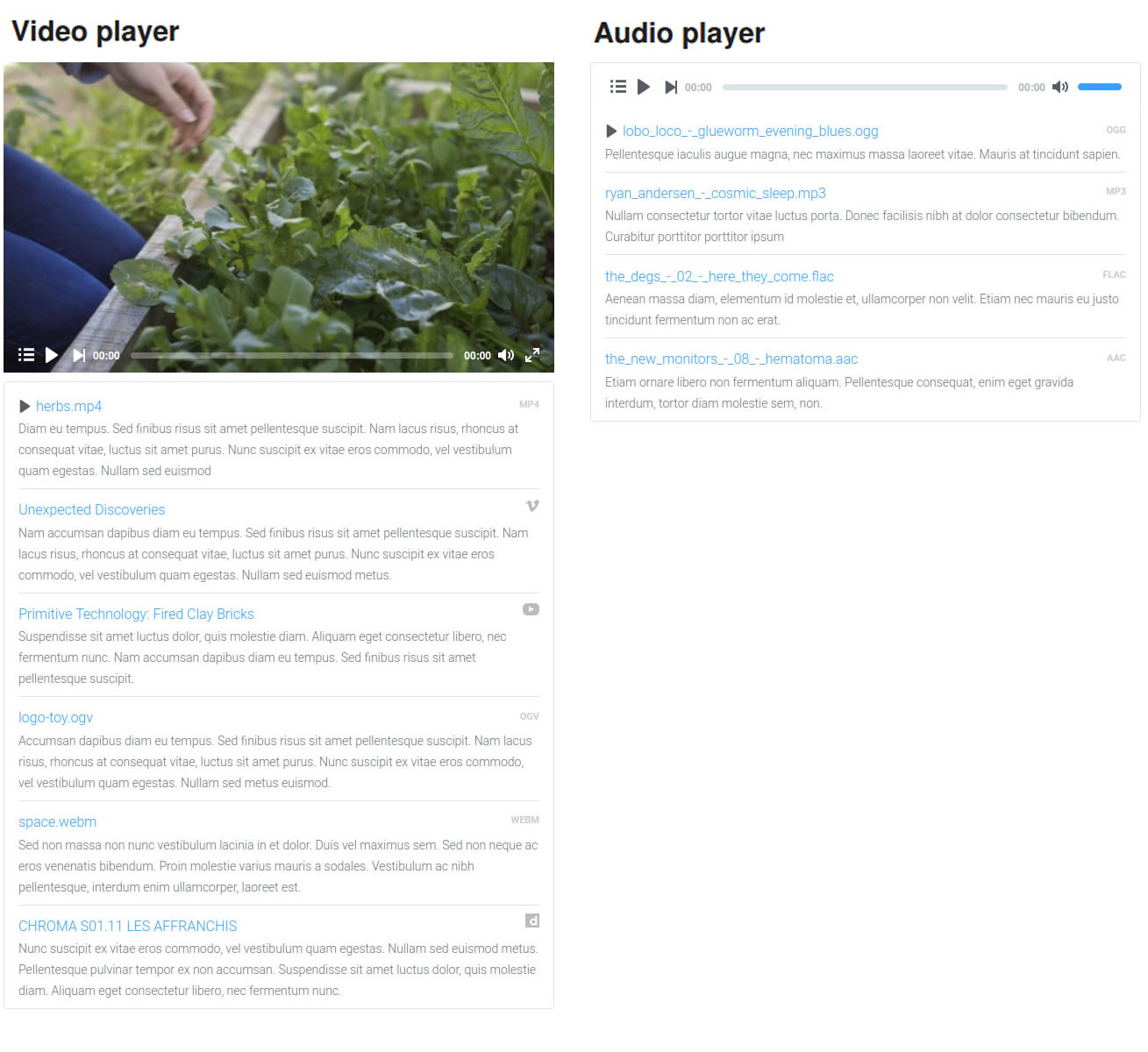
HTML5 player with playlist
Playlist with media description. Thumbnails for remote and local video - not all types. You can mix local and remote video in one video player. Keyboard control of volume and navigation. Several players can be integrated in the same page. Bulk upload.
Video codecs/providers: Youtube, Dailymotion, vimeo, mp4, ogg, webm.
Audio codecs: mp3, aac, ogg, flac.


